Warning: Undefined array key "HTTP_ACCEPT_LANGUAGE" in /var/www/minitokyo/www/includes/common.inc.php on line 360 Vocaloid Wallpaper: Lets Fly with me - Minitokyo
»

Vocaloid Wallpaper: Lets Fly with me

Vocaloid, Miku Hatsune Wallpaper
Vocaloid Series,Game Miku Hatsune Character

2560x1440 Wallpaper

Artist Comment

Hi all. As i promised i reworked some of my old stuff and here is my first one. It takes me lots of time, but its finaly done =)
As my first image the original picture is from bredoman - http://gallery.minitokyo.net/download/562795

This time i do all the lineart, also shadows lines adn lights lines with Adobe Ilustator. Then when i have done i worked with Adobe Photoshop. Added all the colors, first basic colors, than gradient, lights and at end some details as stars at sky, eys and lights ...
This time as you see i dont erase the birds lines and aded the Earth as bg. I will try post here my picture in progress i uploaded that picture on deviant art here - http://orig12.deviantart.net/a4b4/f/2015/257/8/2/lets_fly_with_me___on_work_progress_by_maronkuzakawe-d99laby.jpg

Fell free to comment. Bye, bye

More Vocaloid Wallpapers

Browse Vocaloid Gallery: Recent | Popular.

Browse Vocaloid Gallery: Recent | Popular.

Comments

  1. Monu-chan Retired Moderator May 14, 2015

    Seems like you're finally trying to make more complex works! Glad to see that! :D
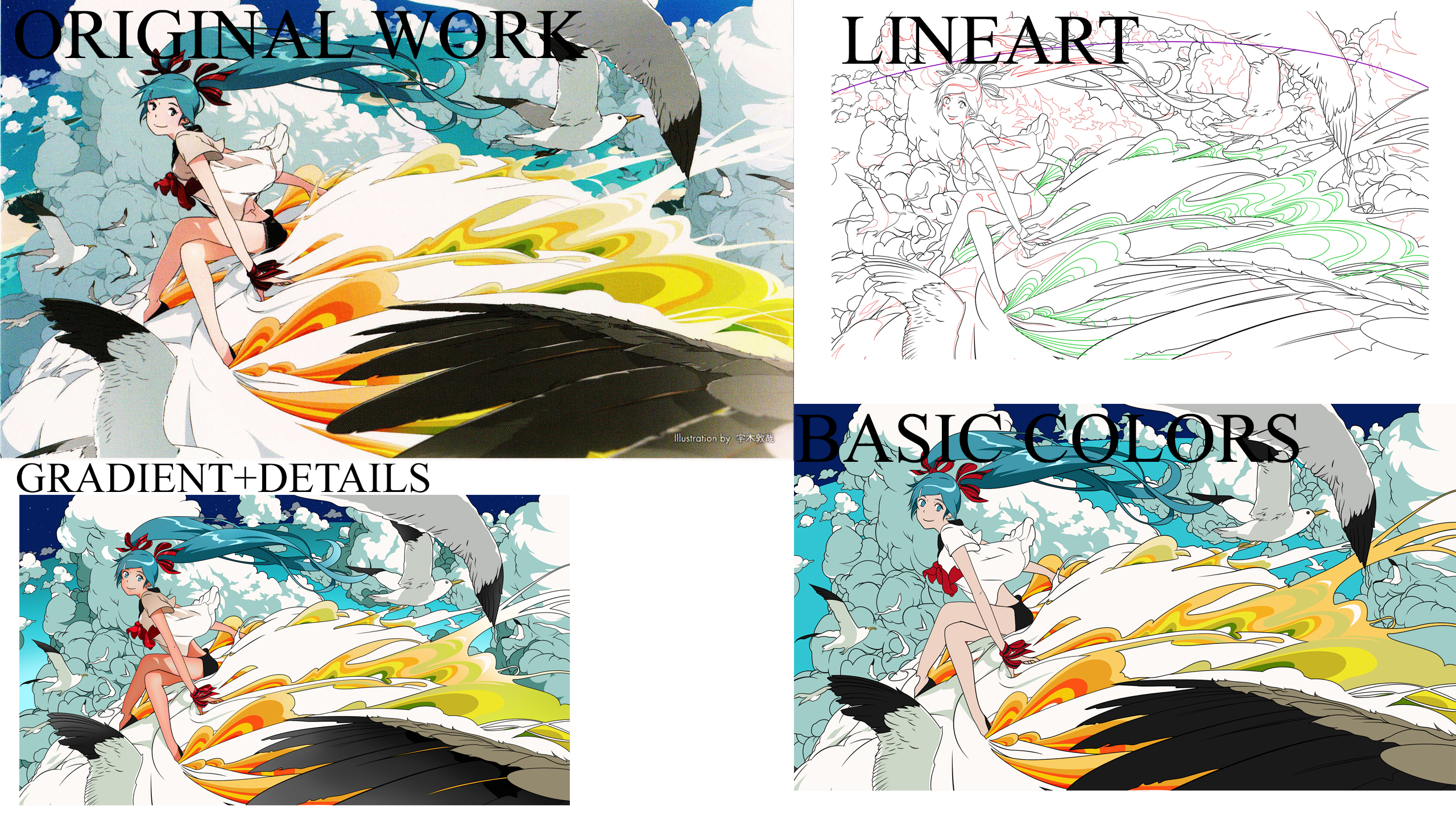
    The lineart is a little too thick in some parts and too thin in some parts, this is not a bad thing, kinda reminds me of Clamp's artworks, but some lines are just to much thin so they are clashing a bit with thick lines.
    And I want to ask why you didn't use lineart of birds? their wings are looking like a part of cloud to me, also for lining the clouds you should have used darker blue/grayish color, and blackish for making line of birds, that way the birds and clouds will look separate from each other.
    Also blur the clouds that are in distance, to make the wall more deeper.
    And also a thing, why sky is just a solid tone of blue? sky has many hues of blue, using gradients, some brushes and then smudge them will help to make the sky more lively. (as in original scan the earth is visible on left side, that means Miku is on pretty good height that's why sky has darker tone of blue because the space is going to start from further up, but here in your wall you didn't made the earth, so it should be supposed as normal sky xD)

    You're going better, just focus on lighting dynamics and also use another layer of shading as gradients, they will make your vectors more pretty!
    Keep it up!

  2. MaronKuzakawe May 14, 2015

    Ty for your comment. I cant help myself, but i like much better when the birds are without the lines. Seems to me more clean. It was looking to hard for me with black art lines, but good point on next time. I wil do the birds with another color or try something new next time.

    With the next point you make, ... the gradient colors and more dynamic. Thats to good point :D ... but i dont know yet how to do it with Adobe photoshop. I searched for tutorials and some clues but realy dont know. I tryed make it another way but it was not pretty so i delete the effect.
    Really thx for your opinion it makes me better for next time. Will try harder :)

  3. Alenas Retired Moderator May 14, 2015

    You are getting better at vectoring but as Monu said, you still need more practice. This is a pretty nice piece but yeah, the sky is a bit too dark and bland in color (usually it's lighter blue closer to the horizon and darker above - like HERE for example) so some gradients would do wonders.

    What bugs me the most right now is the lineart. Things are well outlined but for some reason, your lineart has these white edges/pixels around it which is especially visible on those clouds on the left and the bird's wings on the left side, as well as Miku's red ribbons (mostly on her arm). Not sure whether those are color bleeds (when you color outside of lines) or you didn't color things all the way through so there are blank spaces in between colors and lines. Either way, it's pretty distracting and noticeable so you should work some more on that.

    Also, use 'Quote in Guestbook' option when you want to reply to someone's comment. That way you reply directly to their guestbook and the user is notified, otherwise, replying to your own wallpaper page doesn't let us know you replied.

    If you need/want more tips about your wallpapers, feel free to post them in the Sandbox first. More experienced wallers can help you with their advice there so your wallpapers can get even better. Keep it up!

  4. ShanaFlare Jul 11, 2015

    Wow, love the clear cleanliness of the wall :) I thought you did well :D

  5. Monu-chan Retired Moderator Sep 20, 2015

    I really loved the updated version of this!
    This is what I've imagined it, when I first commented on it! :D
    Keep it up! ^0^/

  6. WhiteParker Banned Member Apr 29, 2016

    cool . I like this wallpaper,. multicolored. its awesome

  7. jacobgraves Banned Member Jun 20, 2016

    cool. very nice picture also. awesome and fabulous

  8. matthewtweedie Banned Member Aug 31, 2016

    i love this wallpers. I like it very much

  9. JohnWilson Banned Member Jan 03, 2017

    cooooooooooooooooooooooooooollllllllllllllllllll

page 1 of 1 9 total items

Only members can post comments, please register.

Warning: Undefined array key "cookienotice" in /var/www/minitokyo/www/html2/footer.html on line 73
This site uses cookies. By continuing to browse the site you are agreeing to our use of cookies. Read more.