
I really like this kind of minimal style wallpaper and in this one I like especially that colors you've choosen. +fav

1920x1200 Wallpaper
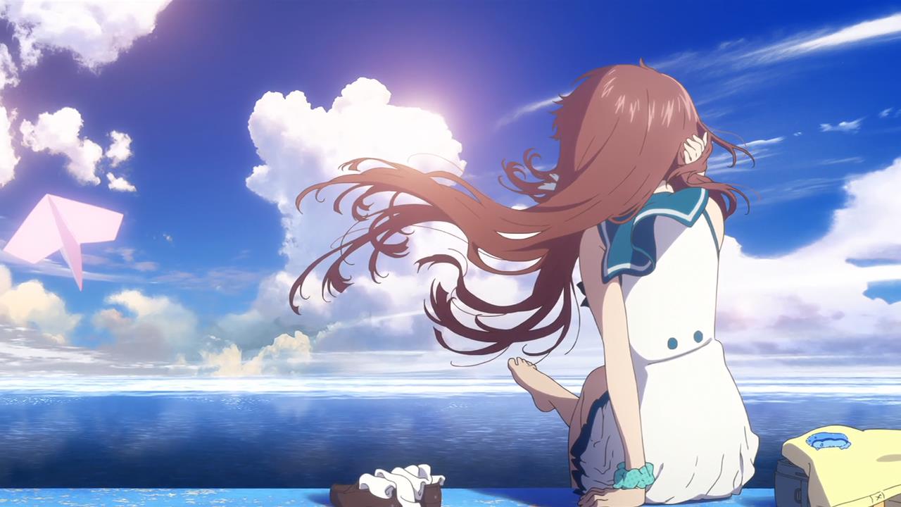
Artist Comment
Just finished watching this beautiful anime, and when I say the second ending I just couldnt pass away with that Manaka
scene, so I decided to edit with it.
The wallpaper is based in a vector art, really was a hard time choosing which colors to use, but finally could use the
complementary colors that look attractive together, the typography is nothing new, wanted to leave it simple since if I
added more stuff it could have seen very heavy for the sight so TA DA! thats all :3
Here I leave the screenshot:
http://bugfox.net/fun/wp-content/uploads/2014/04/Manaka-from-ED.jpg
Opinions and critics are welcome (:
More Nagi no Asukara Wallpapers
Browse Nagi no Asukara Gallery: Recent | Popular.
Comments
-
SamB Jun 08, 2014
-
Hoser1358 Jun 09, 2014
I really like this wallpaper of yours too, very similar to your Kill la Kill one... unfortunately including the one thing that keeps me from using this wallpaper.. well one of two.
The major one being that some of the lines are jagged/rough, which is pretty noticeable when actually using it as a wallpaper. I might be nitpicking but to me it's pretty noticeable, mainly on the hair.
The second thing is excessive text. This is completely opinion, but I don't like the text at the top and bottom. I think it just adds clutter to a minimalistic wallpaper, so I think it would be cool if you uploaded a version without those texts.
Other than those two things, it's another really nice wallpaper. The colours are suitable and are pleasant to look at. -
lianekoishinkurukia Jun 09, 2014
It's a very pretty wallpaper, but I don't think it fits the series. I don't want you to take it the wrong way, I really like this sharp style for wallpapers, but NagiAsu, and that image of Manaka don't really fit with it. Instead of sharp contrasts, bright colors and strong lines, I think it would look better with softer colors and smooth textures
-
wafflefox Jun 09, 2014
Quote by Hoser1358I really like this wallpaper of yours too, very similar to your Kill la Kill one... unfortunately including the one thing that keeps me from using this wallpaper.. well one of two.
The major one being that some of the lines are jagged/rough, which is pretty noticeable when actually using it as a wallpaper. I might be nitpicking but to me it's pretty noticeable, mainly on the hair.
The second thing is excessive text. This is completely opinion, but I don't like the text at the top and bottom. I think it just adds clutter to a minimalistic wallpaper, so I think it would be cool if you uploaded a version without those texts.
Other than those two things, it's another really nice wallpaper. The colours are suitable and are pleasant to look at.yeaaa... its when I export it from the photoshop that meeses up with the sharpness of the lines, please if you have an advice for this i will be glad to know it..
i will try to upload an alternative version in my spare time if you dont mind
Thanks for the comment i will keep it in mindQuote by lianekoishinkurukiaIt's a very pretty wallpaper, but I don't think it fits the series. I don't want you to take it the wrong way, I really like this sharp style for wallpapers, but NagiAsu, and that image of Manaka don't really fit with it. Instead of sharp contrasts, bright colors and strong lines, I think it would look better with softer colors and smooth textures.
Well from the beginning that I made with this style with Manaka I knew that a least someone would say that xD well fortunely i will change my style so be sure that this not gonna happen again (;
thanks for your comment
-
epicmomo Jun 13, 2014
Too much blue... but that's just me, I like how the orange brights up the picture, though...but somehow I dont like how both colors compliment each other...also try uploading a version without those "Manaka Mukaido" text...
Regardless , it's clean and neat. Well done. -
mp4movies Jun 13, 2014
Keep spreading the good stuff !
-
wafflefox Jun 13, 2014
Quote by epicmomoToo much blue... but that's just me, I like how the orange brights up the picture, though...but somehow I dont like how both colors compliment each other...also try uploading a version without those "Manaka Mukaido" text...
Regardless , it's clean and neat. Well done.nah it is alot of blue that was a mistake from me, about the combination, well everyone´s tastes are different and the alternative version i think i will upload it today since i will have more free time to look for the psd file
thanks for the comment
-
Cirru Jun 21, 2014
Nice colors, but the grammar is what keeps me from downloading it.
It would read better as:
"The future ahead of us is endless." -
Tommylaine Aug 17, 2014
coooooooooooooooooooooooooooooooooooooooooo(...)
-
sandylaine Sep 16, 2014
always share this type og stuff ...... i am your big fan
-
bretpaul Banned Member Oct 21, 2014
always share that type of stuff
-
anusteve Mar 10, 2015
I absolutely love your work ...
-
sophia6 Jun 30, 2015
cool i love itt..........................
page 1 of 1 13 total items
Only members can post comments, please register.
