


OMG! This is such a cute vector! X3
Some of the lines seems to be just stroke path. It would had been better using shape for everything including the lines.
But it's not necessarily a bad thing to use stroke path as it saves time but you could taper the endings a little
bit. Even if the scan does not have the tapering, it give better quality to your vector. The coloring and shading could
be improved. You could try experimenting with gradients to get a nice and richer depth to the tones.
Overall it's a really awesome second vector \o/

Akio Watanabe Mangaka
Shaft (Studio) Studio
Bakemonogatari Series
Shinobu Oshino Character
Vector Art Source
2700x3240
Artist Comment
Hi, I'm here to show my second vector in Minitokyo.
Well, it took a while to complete, but the result was good.
Using simple Photoshop's pen becomes a beautiful picture.
To avoid my traditional images to show how it was done my job.
This time I'll be putting a GIF showing the steps.

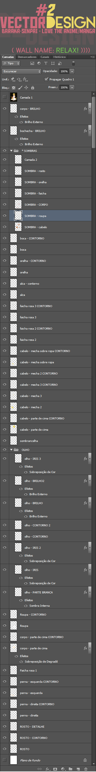
**** Here the LAYERS in Photoshop CS6 **** LAYER 1 - LAYER 2
* This is Original
Scan *
Credit uploader: Fenafir
If you use credit me with: Baraka-Senpai [BS]
More Bakemonogatari Indy Art
Browse Bakemonogatari Gallery: Recent | Popular.
Comments
-
Redwyn May 28, 2014
page 1 of 1 1 total item
Only members can post comments, please register.
