


I would appreciate it if you would link the original image for credits & comparison.
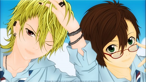
With that said..I'm not sure if you just "colored" it. It looks vectored to me since many of your works are. Perhaps you don't know of the term yet. It is a little bit hard to understand what you exactly did, but that's alright. Afterall, you're doing a pretty good job. I'm glad to have you around.
Your colouring is pretty nice and you even colour the outlines. Be sure to colour those outlines with the same type of darkness/saturation for every colour. I see a lot of inconsistency. For example, the skin and shirt colours are rather bright and light, then you look at the blonde hair and it is really, really dark. You might want to make it lighter so it doesn't make a blunt statement alone. The same goes for the eyes. They are pure black! If you are going to use black eyes/outlines, you're better off using dark outline colours.
The background is a little bit too simple...You could have done a bit more when it comes to effects/shading.
One final thing on close-ups; Face close-ups are pretty difficult to do them properly. The composition would have most likely been better if they had a bit more body to show because they are in fluent positions. Usually the perfect type of picture for close-ups are the ones that are a natural standing/sitting pose so that the gestures don't look distracting. Cutting off most of the gestures kills it a bit composition-wise. You have done them perfectly right before, have a look at those previous works and wonder what makes it exactly right.
