


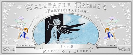
The clean black&white version looks the best out of all three of them. It looks very clean and neat while the green one is a bit too...strong when it comes to the color. The blue and white one would look much better without that texture/brushes overlay you have over the blue and cloudy(?) sky over the girl. It looks too gritty and dirty right now to convey that feeling of freedom. The lineart of your vectors still needs more work; that's especially evident in her hair - some lines are too thick, blunt and choppy while some others are so thin that they look too sharp and jagged.
Also, when you want to link images from other sites, don't use the thumbnail links - codes that may work on AP do not work on MT the same way and vice versa. If you want to link images, just link them normally.

