Just FYI, if I read the artists website correctly his (her? the name seems more feminine) is Nakatani Yuki (the Yuki is
what makes me think the artist is female.)
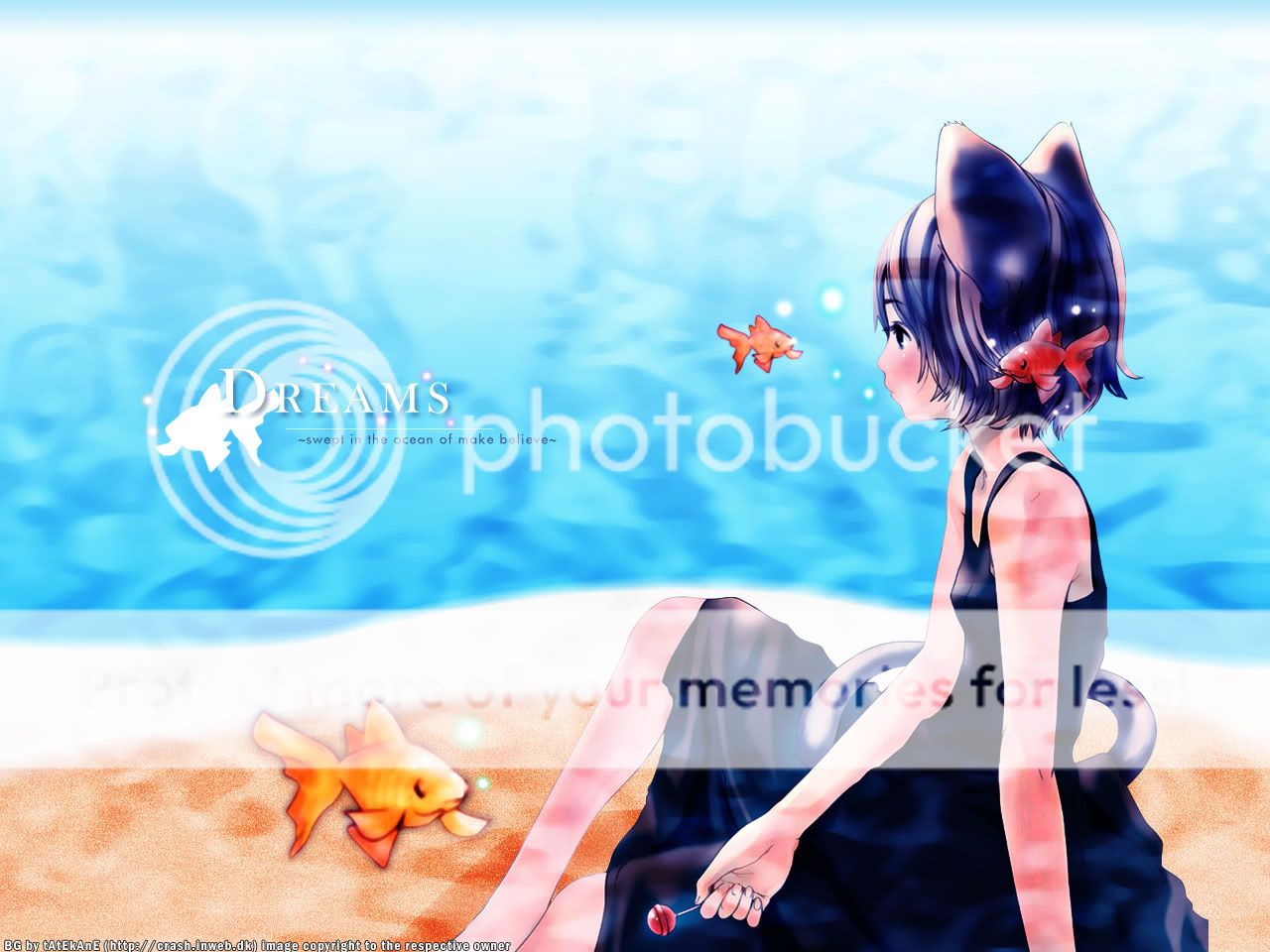
Anyways, onto the wall, the Logo/typography is really slick. The colors go well, although to me a little too saturated
(but I prefer greyish walls, so that's probably just me.) I'm glad you didn't go with the
"underwater" version because the patterns on the character didn't seem to have enough matching to the
rest of the image, unless you swirled lots of blue both in front and behind the character. The fish are adorable!