

Great work, I really like how you use light and shadow in your composition. In this one I especially love the bubble effects! Added on my favs.

Kagerou Usuba Mangaka
Idea Factory Studio
Wand of Fortune Visual Novel
Bilal Asad Ithnan Faranbald Character
Lulu (Wand of Fortune) Character
2560x1600 Wallpaper
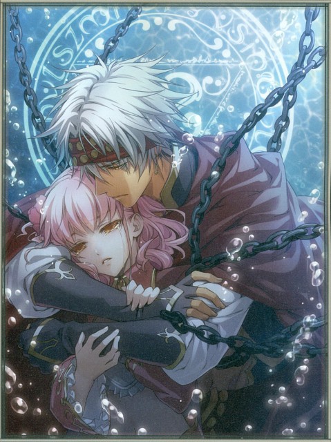
Artist Comment
Hi!
Thanks to Kitten for this awesome scan!
http://static.minitokyo.net/view/32/17/518382.jpg
When I saw it, I just fall in love because of expression of faces... and beautiful design!
The vector was really long and hard! I chose keeping the water theme, I liked the idea they're drowned in tears (so the title!), and the protect attitude of the man. She seems to be so fragile!
I emphazised the atmosphere, cold like water (but not too) in playing with color, lightning, contrast and saturation.
I hope you'll like it!
Cilou
More Wand of Fortune Wallpapers
Browse Wand of Fortune Gallery: Recent | Popular.
Comments
-
SamB Feb 15, 2011
-
snyp Feb 15, 2011
Such beauty, such loveliness, such cuteness, this wall is just so good looking !
Thx for being so awesome and sharing this masterpiece with us Cilou ! Kudos <3 -
chocoripeyes Feb 16, 2011
wow this looks better than the original scan! awesome work +favs
i also noticed you like make a new WP every week or more! HOW DO YOU DO THAT? O.O lol but yea awesomesaucy work! -
MissDaphne Feb 16, 2011
Amazing! I love the atmosphere you added, it's so cool. <3 <3 <3
-
sailorchiron Feb 16, 2011
The small view looks really good, I had high hopes for this wall, but full view, there are some serious issues. Number one, the brightest bubbles are too bright, the blinding, jagged, white outline detracts from the characters and their obviously emotional moment. Number two, the gradient you used for the metal studs on his headband look really lazy. Like, you couldn't be bothered to shade them so they're just flat pieces with a gradient painted on. They don't look three dimensional at all, especially compared to the careful shading on the links of chain. Those two things right there kill this wallpaper. As always, you have a really good start then seem to lose steam and just half-ass the details. This could have been a fantastic wallpaper but instead it's just average. Have you thought about finishing a wall, then waiting a couple days before submitting it? That way you can look at it some more, and ask friends if they think it's really finished. You do so many walls that could be superb that just look like your rushed at the end and didn't finish properly, and that's a shame.
-
Kurorisa Feb 16, 2011
I actually kinda like the colors you choose, but aside from that I have to agree what sailorchiron said
most of your works are half shaded and half detailed
I expect more from you because the thumbnail looks good
try to shade more on the chains, they look really boring while you actually can shade them and made them interesting
the bubbles are interesting, but I feel like they're missing something
I think if you add more lighting, it will become more interesting, just an opinion though -
srsn Feb 16, 2011
Quote by sailorchironThe small view looks really good, I had high hopes for this wall, but full view, there are some serious issues.
--> I also thought of that one because when I saw in my notification page, a new wall, I didn't recognize it was yours because of the nice thumbnail, but it really disappoint me when I saw the full view.
The bubbles are very sharp and flat. I think if you used multishading like my tsubasa-chii wallpaper and no lineart, it would look nicer and softer. As for the shading, I would like you to really do multishading, not just a simple basecolor tapped with 1 shadow layer and tapped with 1 highlights layer and then just gaussian blurring them. Try adding 2 or more vectored shadow layers to give color transitions. we know how fast of a waller you are, but it's useless if it's half-baked. Please consider our opinions because we really want to see you improve. You're really wasting your skills like this.
-
greenemerald Feb 16, 2011
i don't need the sea to drown
or to fall the gutter
just hold me in your arms
and i'll melt like butter! -
Lixe Feb 16, 2011
this looks better than the original scan! Great work,
love the bubble effects -
CrimzonThorn Feb 17, 2011
I love it. It is beautiful. You did a great job
-
tsukoyomi92 Feb 17, 2011
c'est tellement beauuuuuuuuuuuu! thanks for sharing ^-^
-
Kawaii-Vesperia Feb 18, 2011
very beautiful scan ! thank you for scanning
-
ru0956 Feb 19, 2011
omg i love this pic this is my favorite am going to add it now hooooooo is so cute
-
lenalee87 Feb 19, 2011
awesome! it's really great job!
i like it...^o^ -
syaolee Feb 19, 2011
Love this pic!
it's a very beautiful!
-
bluechopstick Feb 19, 2011
beautiful! ? beautiful! ? beautiful! ? beautiful! ? beautiful! ? beautiful! ? beautiful! ? beautiful! ? beautiful! ? beautiful! ? beautiful! ? beautiful! ? beautiful! ? beautiful! ?
-
shelke-chan Feb 19, 2011
such a beautifull scene
thanks for sharing!
that's so romantic @^^@ -
Pinkya Feb 19, 2011
woooooooow! Totally awesum :D:D
i love it soooo muchiee~~~ <3
Keep it up :3 -
xellon Feb 19, 2011
Awesome pic. thanks for the scan.
-
saozzaa Feb 20, 2011
Good Pic!
It's beautiful
Thank for sharing! -
chobits1220 Feb 20, 2011
GOOD WALLPAPER NICE ART~
THANKS FOR SHARE! -
alvinpatrickxxx Feb 20, 2011
cuuuuuuuuuuuuuuuuuuuuuuuuuuute
-
Animezealot5140 Restricted Member Feb 20, 2011
Nice~ I was waiting for someone to wall this. More shading on those light brownish decoration on his headband, earrings and the collar would look much better. =)
-
saver7621 Mute Member Feb 24, 2011
ow this looks better than the original scan! awesome work +favs
i also noticed you like make a new WP every week or more! HOW DO YOU DO THAT? O.O lol but yea awesomesaucy work!
page 1 of 2 1 2 Next » 29 total items
Only members can post comments, please register.
