


I love your text, how it looks like its just thrown on top of each other <3
You're right there some jagged-ness but its not too much to worry about.
To ensure I don't get jagged edges when I vector I make the wall at 200% the size I intend to submit it at, so in
your case 3200x2400 then merge all the layers and then reduce the size to 1600x1200.
Note* Its important to merge before reducing size.
Try that in the future ^__~ V
Kouji Kumeta Mangaka
Shaft (Studio) Studio
Sayonara Zetsubou Sensei Series
Nozomu Itoshiki Character
1600x1200 Wallpaper
Artist Comment
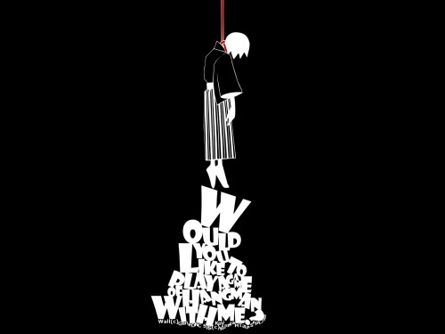
I've been wanting to make a Sayonara Zetsubou Sensei wall for a while, even though I've never seen the anime/manga. I like the artwork and wanted to make a simple wallpaper. I decided not to include any texture or pattern in the background to keep it as simple as I could, since whenever I attempt a simplistic wall it always ends up way too cluttered.
I hope the vector lines are not too jagged, I struggled with them a little and they still looks a jagged on my desktop (1024 X 768) but seem fine at full view and 1280 x 1024. So let me know if you see a problem that I don't.
Scan: Here
Time: About 2 days
Additional resolutions and wide-screen at AP.
Inspiration: Drake's "So Far Gone" cover art. XD
I hope you like it. Comments and faves will be appreciated.
P.S. Just so you know, I'm not depressed or emo or anything. :P


More Sayonara Zetsubou Sensei Wallpapers
Browse Sayonara Zetsubou Sensei Gallery: Recent | Popular.
Comments
-
Kritty Sep 27, 2009
-
Hellios Sep 27, 2009
Loved the wallpaper! Simple, but very attractive! Any widescreen format ;D?
+fav -
Emma93 Banned Member Sep 29, 2009
whao! Creative walli indeed! i like the idea and the text too, keep it up! :)
-
MapleRose Retired Moderator Sep 29, 2009
I love the text, how it piles on top of each other in a pyramid shape yet you can still read it. The red for the string makes it stand out nicely. Overall, very creative (is it bad that I laughed while reading the text? XDD)
-
vitaamin Sep 30, 2009
ah finally on a computer so i can comment--i love the text placement. i think its perfect in every sense of the word and a good break from lazy, random text-whoring or title placement without focus. i do think some of the vectoring on the character in terms of color etc could have been more creative and given a funkier feel to the wall--but thats really nitpicky. just wanted to see if i could get you to push the envelope on that creativity ;D
-
bromithia Retired Moderator Sep 30, 2009
It reminds me of the cover of Drake's album "So Far Gone," lol. I mean, they are pretty much the same as far as color scheme and placement.
See here -> http://i34.tinypic.com/alkrwy.jpg
-
BraveSoulXX Nov 19, 2009
This scan is so cool. Thanks for sharing!^_^
-
senenga Dec 12, 2009
I love it. It's so simple and great. <3
-
zeileeaang Dec 18, 2009
soo cool :3
--
i'm in despair xD -
Dracard Feb 21, 2010
I CANT TAKE IT ANYMORE
YOUR SKILLS AT MAKING WALLPAPERS HAS LEFT ME IN DESPAIR!
-
tigerhorse Apr 26, 2010
zetsuboshita!
thx for sharing here! -
scrimsone Apr 29, 2010
i love this! the inverted colored itoshiki-sensei hanging on those words are so cool!
-
dgr2k8 Jul 25, 2010
XDDDD Awesome
thanks 4 sharing, Good job ^.^
-
aQuaresDviA Sep 04, 2010
cool wall!with darkness mood!i like it!10/10!thanks 4 sharing!
-
lucy-lu-chan Mute Member Oct 20, 2010
thank you for your sharing ^^
-
aoraki Nov 24, 2010
very nice one! really love it!
-
creamloy Dec 17, 2010
nice image thank you for sharing
-
jurock Jan 04, 2011
i loved this one xD arigatou gozaimasu
-
pinkuxfeliks Feb 03, 2011
xDDD Nozomu~~~
So fun (?) 8d
-
drogodp Feb 25, 2011
Loved the wallpaper! Simple, but very attractive! Any widescreen format ;D?
-
HRB Apr 27, 2011
Wow great job on the text! I just love the whole idea. Simple but brilliant.
page 1 of 1 21 total items
Only members can post comments, please register.
