
This is really beautiful. I can't quite put my finger on what is the concept here, but it's really appealing
despite its abstractness.
So good job, I like the texture you used, not too rough, yet noticeable <3

Artist Comment
This is for the Minimal-ism Project... if it's still going on.
Woo, another wallpaper! That was... really fast for me.
;__; I need a moment.
I'd like to point out that music really IS a factoring agent in artistic creations. I mean, the style of this wallpaper has changed so much, due to my playlist changing.
When I found this scan, I was listening to Pain of Salvations piano piece "Pluvius Aestivus". I grabbed the scan, and started vectoring. The orginal them I was going for was to recreate the room, and have it raining outside. The multicolored birds were gonna be shades of blue. Reason is... well, that song is POWERFUL, and quite emotional. Has almost.... a sorrowfulness to it.
But I got bored of the song (lol listened to it 50 times in a row) so switched to Riverside. Their album Rapid Eye Movement was first on my Riverside playlist, and everyone knows that album
is love. <3
When the songs "Through The Other
Side" and "Embryonic"
came around, my artistic vision CHANGED before my eyes.
To me, those two songs have a.... serene, yet detached feel to them... and oh so beautiful, of course.
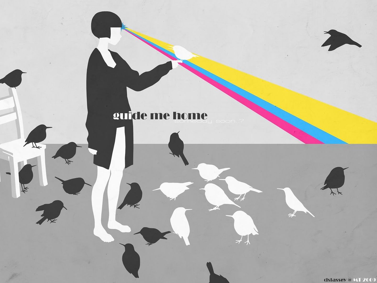
So I wanted to ditched ALL lineart - just work with shapes. Easy enough. I decided to go black and white, kinda touching in on some art deco-ness. Then I asked myself, "You know what would be cool? A freakin' rainbow shootin' outta her head." The rainbow, however, did not work out. So I decided to work with a color scheme I've always liked - hot pink, blue, and yellow! And why use a rainbow when you can have a laser beam shooting out of her forehead? =D
The text reads "Guide Me Home", with the subtitle of "Someday Soon..?". I felt like she could be asking that bird to guide her to freedom. Again, came from the detached feeling I got from the songs. I tried to keep the font as art deco as I could.
In the end, I love this. It's simple, strange, and somewhat... posh.
Comments are always welcome. Enjoy, kids~
EDIT: No Blur Version


No other submissions
Comments
-
Sakura-Dust Aug 03, 2009
-
bromithia Retired Moderator Aug 03, 2009
Nice. I like the simplicity going on here, and the shapes are all pretty neatly done.
Btw, I'd be interested in seeing a version without the blur. Is that possible? Anyway, keep up the good work.
-
DarthTofu Aug 03, 2009
For some reason this reminds me of all the obese pigeons that used to follow me around in the hopes of getting food.
RAINBOW LAZERS. Technically neither, but a technicality is only a technical matter. -
sailorchiron Aug 04, 2009
Holy-- This is *bleep*ing awesome! I like the blur a lot, it adds to to the impression that she's detached from reality a little. It's VERY serene but with energy somehow. You used grey again and I lurve me some grey/magenta/yellow/blue and you know it. Love the birds, and the lack of line art is fabulous. And...is she wearing just a long shirt..? ;D Totally wicked. Oh, and I need to hear the music that inspired this, like, yesterday. <3
-
Nubes Aug 04, 2009
U should add more brigth because it looks kinda blurry... but i think the theme is really nice.
-
okamineri Aug 05, 2009
this is an amazing piece....i love it.
-
FallenAngelZoicyte Aug 05, 2009
This is simplistic and lovely. I love the printer cartridge color scheme. I love the no outlines, it makes it very flowing and minimalistic. I love all the fat birds on it and that is a awesome chair. It is a small part and off to the side and all but I am really impressed with its chairness and do not think enough people appreciate good chair art. ^,,^
-
happypk04 Sep 05, 2009
dood....I love this style...
so graphical...
AMAZING. I love it's simplicity. -
grabancz Dec 20, 2009
hey you got it. all grey but a rainbow.
-
Anna-UK Jun 12, 2010
o-o is so strange and nice *-*' *freak*, I love it <3
page 1 of 1 10 total items
Only members can post comments, please register.
