


Lovely, I like the scan, her expression is so "lusty" X-P Nice work :)

Artist Comment
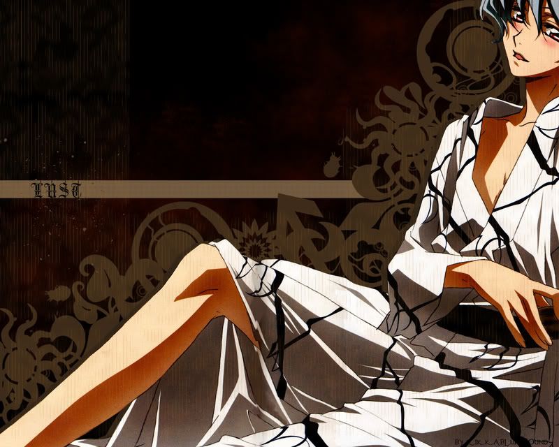
Please FULL-VIEW, it looks less blur & pixelate

This is a seriously good anime & I would really recommend U guys to watch it... especially those who are Yaoi fanatics... *___*
Firstly, Lets celebrate the 1st round of my exam which is over! XD
Got to prepare 4 the 2nd soon T_T
Anyway, My mum spare me for today... only 1 hour... =_=
But well... I managed to crack the comp psswrd, not the net psswrd though... >_<
So, I did this wall while she went 2 work... XP
Well... Its kinda different from my usual, I wanted it to b slightly more unusual... >_<
I dun really know what style this should be called... >_<
It started out like this:
Lust-GRUNGE+ABSTRACT
U have to see it, it might suit U guys more, tell me though
Which is kinda normal... >_<
Not that this is really unusual though... T_T
I didnt really like it though... >_<
I tried the sky toning with brown but it looked kinda odd, so I stick to blue... >_<
Well... I dont really have anything to say except that I kinda got tired with the patterns there so I cloned it... XP
Its all handmade by using the custom shape tools & making some changes, then there was some grunge brushes...
Sorry, dunno how to clean the scan... >_<
Hope U like it anyway... >_<
Scan: Kantarou and Haruka by Tokitoh
Group Advertisement:
JOIN OUR GROUP:
Join us CW today:

Join Us: 


Join our group now! ;)

JOIN SONGSTRESS REVERIE: 


More Tactics Wallpapers
Browse Tactics Gallery: Recent | Popular.
Comments
-
Melisandre Oct 08, 2006
-
schwindelmagier Oct 08, 2006
nice new wallie, Rikk-chan and thanks for the reply on my PM to you ^.^
Yeah, I guess it is exam-time..everywhere on the world @.@. I also still have to write some tests. Three next week, THREE! How cruel -.-...i don't want to....meh..BUT, to the wallie.
I love the scan. She looks a little bit like the Vize-captain of one character in Bleach, forget her name >.<.
the brushes/pattern whatever are looking good on the bg but the san looks a littl ebit strange with the thin brown (?) lines on it (not the motive on her kimono, that looks great.)
I hope you can understand what I mean, I have no idea how to express this in english words but, this is only random....and you already said that you had no idea how to clean this scan ^_^
if you take the whole wallie, it looks great, fav from me
-
Fran Retired Moderator Oct 08, 2006
Oh his is expression is so lusty *_*
I dunno why but I like the grunge version better
Ano, what's the name of this anime?
Anyway it's a great wallie!
Keep it up :) -
aishiteraburu Oct 08, 2006
ooh Rikka has a new style XD
I love the custom shapes , the way u've used it, Kind of looks like patterns which is cool
Very neat wall , Good job -
kashikosa Oct 09, 2006
Kan-chan! He looks so great on this scan! Beautiful work here. I'm not so sure that Tactics is THAT much of a yaoi. It's light shounen-ai... Still it's a great anime and I just loved the pair Haruka&Kan-chan. Thanks for sharing
-
Chloe Retired Moderator Oct 09, 2006
Very cool work, though I like the Lust-GRUNGE+ABSTRACT version more.
-
Kiako Oct 09, 2006
it looks very good, the bg is well done, and the chara fits in.
keep it up -
starrliteangel Oct 09, 2006
hmmm...I think i like the grunge abstract one better. For the one you uploaded to MT, I suggest you leave out those birds. Theyre a little random and dont fit in too well. the MT uploaded one looks a bit odd too, because the black vector shapes extend over the window...and it just seems kind of weird. the grunge-abstract one looks awesome!
merged: 10-09-2006 ~ 11:49am
hey hey, update your wall with the grunge-abstract one so i can feature it. lol XP -
Elves Oct 09, 2006
I like the blue sky - it sort of differentiates and makes it seem that he's cut off from the outside world. I like the line textures that you've put over just the main image. I'm not crazy about the gray/brown shadow that divides him from the black decorative-grunge things though. If you want to keep it maybe just give it more of a blurred edge. And by the placement of the character - focusing on his body, rather than his face - you have indeed created a lust-filled wallie. XD You go girl!
-
Jim3535 Oct 09, 2006
I like the wall, but I would suggest that the vertical lines detract from the overall presentation. The scan is a tad bit grainy too; if it was cleaned up then it would be a really awesome wall.
-
Rhonda21 Oct 09, 2006
yeah this is cool and I agree that I like the other version a bit more just because this one is like two styles mixed which is cool and all but it doesn't seem to go as well together. But I think it still looks great either way!
-
Acuni Oct 09, 2006
i like the things around the person *black things*
and it looks cool just siting there and doing nothing
keep it up^^ -
AWOL Oct 09, 2006
The shadows are solid, the space is used well, the colour match (brown, black, white, black) is consective; giving it a pattern. But I don't like the way the character has to be cut or seems to be cut, then squeezed to the corner of the wall. It loses focus and brings contempt on my part.
-
cassandraronald Oct 09, 2006
*full views*
Kan-chan looks sooo kawaii XD
i like the Lust-GRUNGE+ABSTRACT version more than this though...
good job
oh and good luck for your exams ^^
+favs -
Rikkablurhound Oct 09, 2006
I updated it T_T
WIll put up the other version(actual) NExt time T_T -
rollingmreg Oct 09, 2006
I'm sorry. I do not understand who it is.
-
Devildude Oct 09, 2006
well... not that I am interested in sexy dudes....
but this wall does have itself a nice feel to it, very relaxed, but imo, the text is always and can still be a little better, I think this one would look even better without it. -
uchiha-vegeta Oct 10, 2006
gotta agree with DD abt the dude thingie ... but its amazing overall =) , keep it up!
-
thecatmistress Oct 11, 2006
0-0 wow. major cool
-
Farewell Oct 11, 2006
mmm.. so interesting wall.. cool background. That's all i'm gonna say. XD
-
Sayonara Oct 11, 2006
omg omg sooo h>O>T. i loooove ! yaoi-fan here!
Nice background and the colors match really good with the scan. Nice job Rikka-chan, ^________^ -
Yureika Oct 13, 2006
cool rikka !
very unique..not ur normal style i guess
nyways great choosing of colours but i really hope to see more of her face rather than her long skinny leg .. -
saranron Oct 17, 2006
Kya~~~~! Kan-chan so sexayyyyyyy!
I watched this anime and loved it! Personally, I don't think it is shounen-ai anime at all, but I do agree that Tactics is really good.
Hmmm I assume I missed the previous one? Anyway, this one is awesome! Love those patterns. I hope you didn't cut out his head as much though. His slightly tousled hair would add to the sexiness. Oh, nice title there. In this scan Kan-chan is really the picture of lust....Kya~~~~.
-
Milkiyo Oct 17, 2006
I've seen the anime but I prefer Haruka, this guy (I forgot what-zis-name) seems so money-minded haha :P
nice new style but the line with the word lust seem to contrast too much with the style but nice colours btw :)
the bg's a little blur but otherwise ok
page 1 of 2 1 2 Next » 35 total items
Only members can post comments, please register.
